Here’s a selection of boards I designed during the School of Motion Design Bootcamp.
Mission to Mars - Nasa
School of Motion had us come up with 6 design boards for a new show called “Expedition 100: Mission to Mars”. The boards had to show footage treatment, full-screen title cards, show title + tune-in screen, and NASA TV logo, in an overall dangerous, awe-inspiring and cinematic mood.
Alt Designs
Tokyo Throwdown - FOX
The brief for this project was to come up with a Show Opening set of designs, as well as a Title Design for Fox’s new show called Urban Freestyle: Tokyo Throwdown. The show is a Dance-Competition that takes place in Tokyo, Japan. Teams of break dancers compete each week on the streets of Tokyo in head-to-head dance battles.
My baseline idea was to work with urban silhouettes inherent to Tokyo like the crosswalks/bridge/skyline, overlayed with kimono and origami patterns, while adding a few recurring graphic elements.
Logo Reveal - Converse
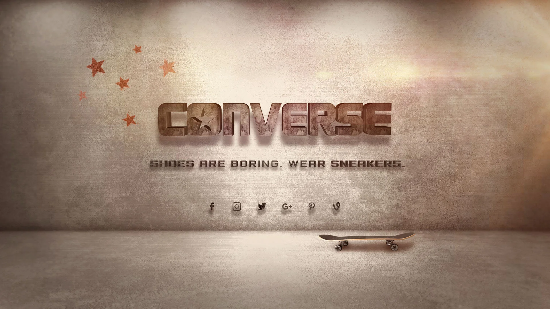
This brief needed the students to design 3-4 styleframes showing the progression of a logo reveal for a :05 Converse animation to publish on their social media. Something high - end, authentic with a splash of edgy that speak to the Converse brand. I decided to give the Converse logo a concrete texture in C4d for the letterforms to become elements straight from the skatepark. The skaters would use the logo as slides for their jumps until the logo is finally revealed in that smooth cement environment, as a celebration for all the skaters who makes the brand Converse strive. I wanted to convey the look of the famous LA Venice Beach skatepark at sunset time and give a warm tone to the concrete textures.
Everlearn.io
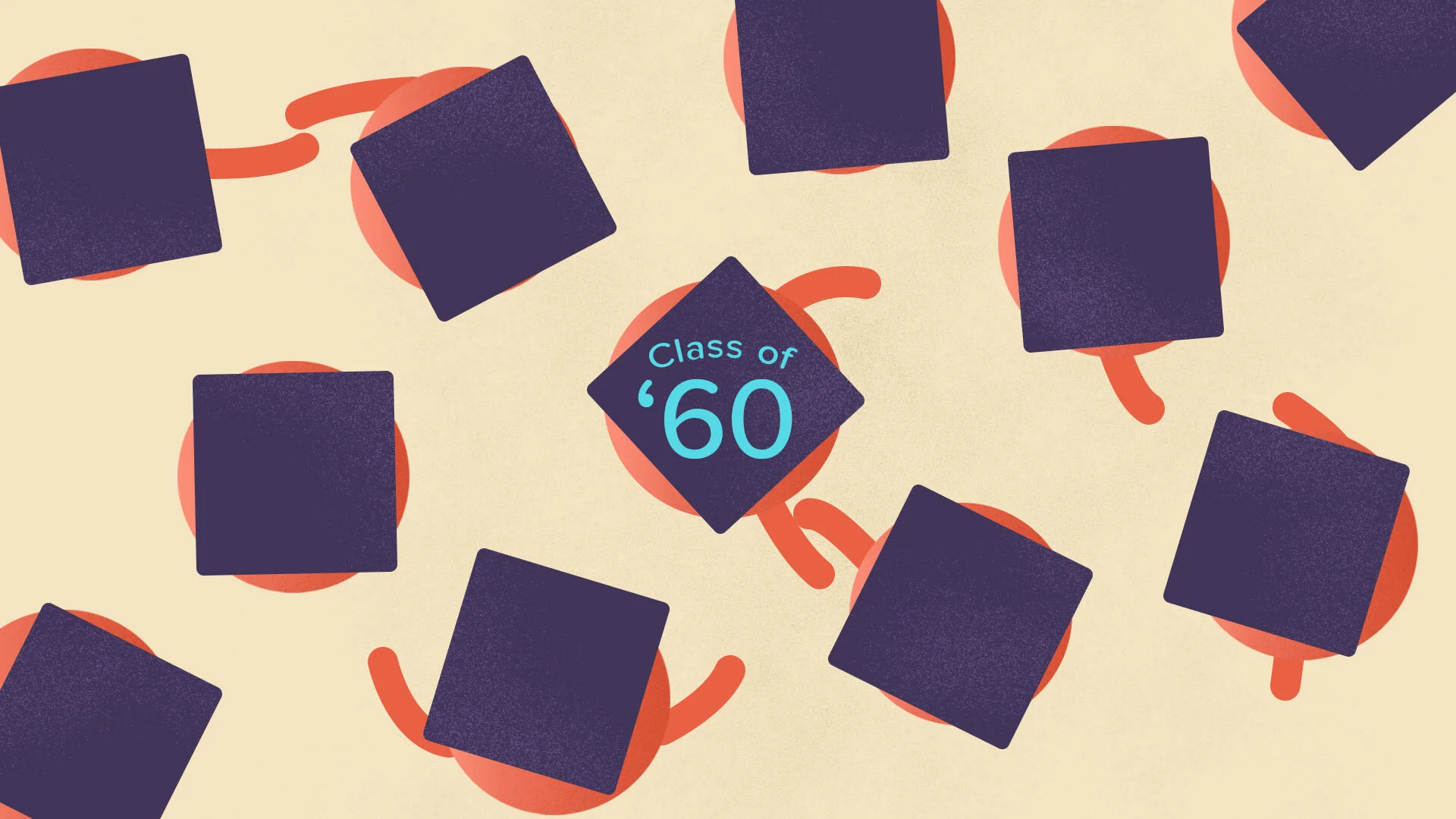
With a script provided, we were asked to create a design board for a :15 spot that drives the consumer to everlearn.io. My idea revolves around the symbolic “throwing the graduation cap in the air” - the ultimate freedom and successful education gesture. But with the student debt increasing every year, college students cap’s can’t fly high anymore as they are being weighted down by those crazy debts. When the status quo finally breaks, the cap gets to stay in the “clouds” representative of the internet space!
In 1960, the average college grad had $4000 in student debt. Today, that number is 10X higher with some owing more than $200,000. We think learning shouldn’t be a luxury. Go to everlearn.io to find out more about the New Education.
Title Sequence Design - 12KM
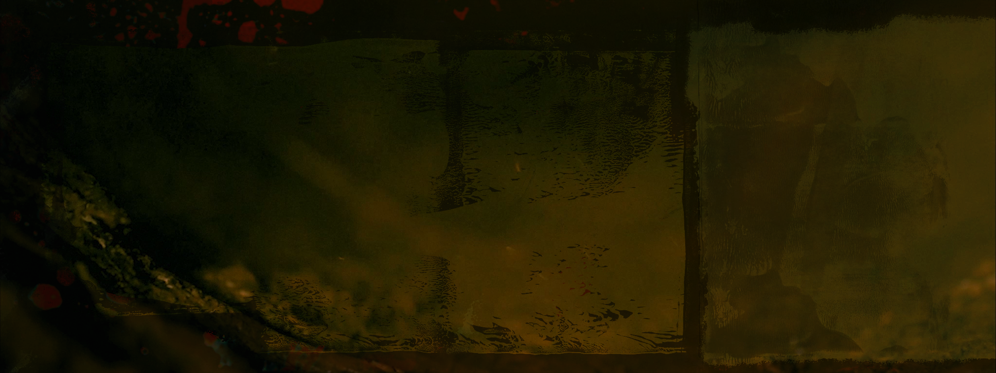
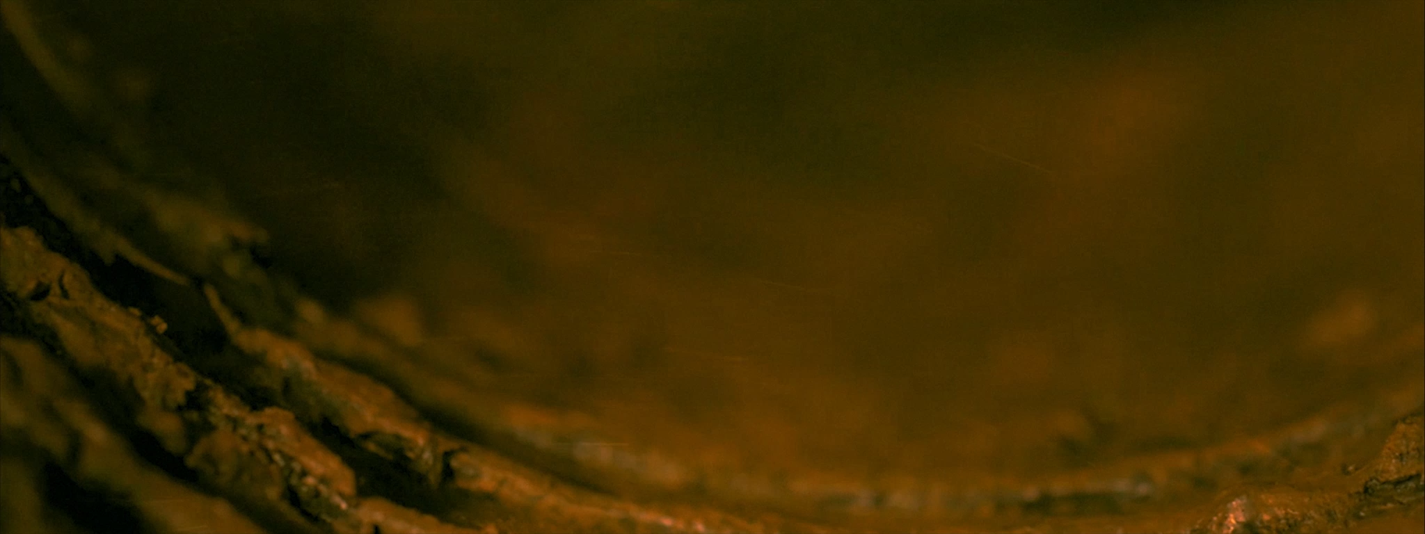
This assignment was about creating a title sequence for an author horror film, 12 Kilometers. The opening title card and end card needed to be designed for a dark, creepy, and ominous tone, while finding clever ways to transition from GFX to footage and back. We were working from the film’s trailer that reminded me of ink, drippy paint and ripped paper textures. My transition frames use a mix of big grungy paint textures that would serve as alpha mattes for the footage to appear in a collage fashion, linking to the analog old film strip look. I also wanted some frames to feel heated and almost close to a furnace.
This work was created as a homework assignment for the Design Bootcamp course from School of Motion, Inc. All work is speculative and created for educational purposes.


